

 We’re always fascinated when someone takes some raw data and somehow converts it into a printable object. Recently Thingiverse user TheNewHobbyist created a great model using the United States Electoral College. For those unfamiliar with obscure US election rituals, it is simply a quantity of votes assigned to each state for purposes of presidential voting.
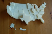
 The vote counts were converted into Z-heights for each state to produce a physical 3D “chart” of the data one might typically see in an Excel spreadsheet. The states were clumped into eleven printing plates designed to maximize your print efforts. Once printed, you simply line them up appropriately and you have your chart.
After seeing this we can easily imagine someone developing a “generator” app that accepts “state data” and produces printing plates with state heights that match the input ratios. If this were available, it would essentially be a way to quickly physically produce frequently found Excel charts.
Via MakerBot and Thingiverse