
If you’ve been troubled with the sometimes confusing interfaces of Asian 3D print software, it turns out there is a reason why this happens.
I’ve been using software from Asian companies for many years, as tools typically come with the desktop 3D printers we frequently test at Fabbaloo. While the hardware has been steadily improving in quality over the years, the same can’t be said about their software.
Or at least that’s how it often appears. There are, of course, the usual mistranslations of specific words that lead to confusion, but it’s more than that. The user workflows through these tools often seems longer than necessary, and there are way too many buttons and options present.
For several years I’ve been mentioning this to multiple Asian 3D printer manufacturers, hoping they would “just hire a proper UX person” to design nice interfaces that people would find easier to use. My theory is that the Asian equipment’s software tools are typically the weak point, and that if they were easier to use, particularly for new users, they could sell far more machines.
But no such changes happen. Sometimes we’ll see an interface become “painted” with different colors, seemingly in an attempt to reach Western users. However, even the color selections are frequently difficult: light gray text on slightly darker gray text is very hard to read.
Why is all this happening? Why don’t the Asian manufacturers take the very easy step of just making a proper interface like every other Western company does?
It seems there are deep cultural reasons for this. I recently watched a very enlightening video explaining this effect, by Phoebe You, a “UX designer with a degree in cognitive science”. That’s exactly the person that can unravel this situation.
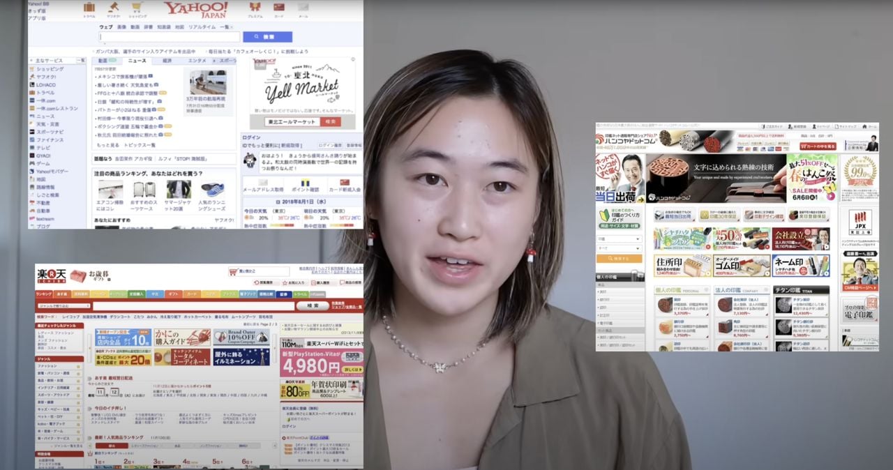
The video, “Japanese Web design: weird, but it works. Here’s why”, explains the often overly-busy and strangely styled websites often seen from Asian companies. At top you can see Yu with several typical Asian website home pages that could not possibly be created by sensible UX designers in the West.
Yu expiains that in Japan (and other parts of Asia) there is a concept called ”安心” (“an-shin” in Japanese), which means “peace of mind”. The idea is that the customer experience should not hide any unwanted surprises.
Because of that cultural principle, websites tend to “show everything possible”. That’s why they are so busy, and explains why Asian restaurants tend to show images of each and every dish. This cultural principle almost certainly extends to the designers of 3D printing software, which is why they can also be “busy”.
Yu also explains the difference between “low context” and “high context” cultures. A low context culture would, for example, immediately and directly describe the desired outcome. A high context culture is far more subtle. Yu provides an example to illustrate this concept:
”Society we believe that good effective professional communication is a communication that’s very, very explicit, that’s very simple and very clear. Let’s say your neighbor has a kid who plays piano at 2AM every night causing you to lose sleep. In a low context culture, such as America, you might knock on their door and say ‘yo I can’t sleep because your kid plays piano at 2: a.m. every single night please stop’. That would be low context culture: very straightforward, to the point.
In a high context society you might approach your neighbor the next day, you know, casually walk across them and say ‘hey your kid plays piano really well’. So let’s be real here in both cases you want the kid to shut up, but in a high context environment this delivery is more nuanced and the neighbor would still understand this as a request to be quiet.”
As you might imagine, a Western person with a loud piano child would likely not understand the message at all.
I believe this expectation of subtlety is also part of the challenge for Asian software makers when designing interfaces. This could be another factor why the interfaces can be confusing.
Finally, Yu explains the Japanese culture of “Kyo”, which is a strong fear of embarrassment. Yu explains it this way:
“The Japanese user often measures convenience by the amount of inconvenience they avoid causing to others rather than solely the time or effort saved for themselves.
Let’s say you’re at McDonald’s you’re using Apple Pay to get your McFlurries and Fries. The American user might be like: ‘this is super convenient my wallet is lighter I’m carrying less coins when I tap I don’t even feel like I’m spending money’. If you’re a Japanese user you might think Apple pay is very convenient because it helps me not hold up the line for other people I don’t have to fumble through my coins make everyone wait.”
This can manifest in an interface by altering the workflow in ways that try to assure the user they are not inconveniencing others. That may explain some of the very curious workflows seen in Asian software, at least to my Western eyes.
What should happen? It seems to me that Asian companies build software for their machines that would be used by BOTH Asian and Western operators. That creates a huge conflict in design, and thus it is not surprising the software is confusing. It’s probably confusing to both cultures.
One approach could be to write the core of the software, and then design completely different interfaces on top, one for each culture. However, that is probably more expensive, and not something these highly competitive companies would do.
At least now I have a better understanding of why the software interfaces are the way they are.
Via YouTube