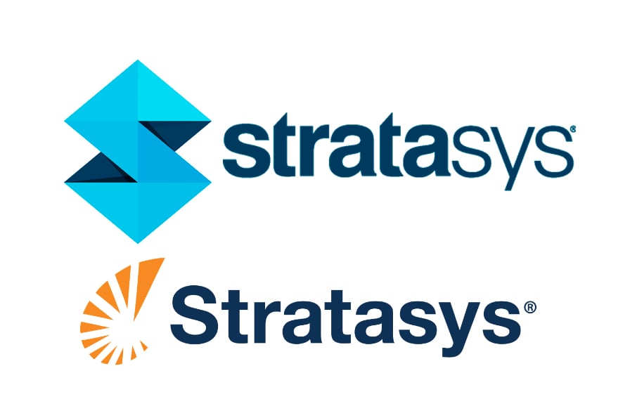
Somehow we totally missed this, and perhaps you did too: Stratasys has rebranded with a new logo!
According to our research, the 3D printing mega-corp switched out their old logo for the new one sometime in the beginning of last October.

The old logo, shown here, was a refinement of their original logo, shown below.

This original logo was a take on a nautilus, a sea creature that becomes a larger object by gradually building new “layers”, in much the same way as Stratasys’ equipment can print objects.
The question is, why did they rebrand?
We can imagine two reasons.
First, it’s just time to do so. As you have seen above, they have rebranded before and some companies simply feel that they want to keep things fresh by re-logoing periodically.
The second, and perhaps more strategic reason might have to do with their stock price. As readers may recall, the stock prices of not only Stratasys, but other major 3D print companies has fallen dramatically in recent months.
Our thought is that the price crash was mainly due to a backlash after overly-excited investors bought too much stock and drive the price unrealistically high. Sober second thoughts have reduced demand for the stock and its price has fallen.
But now we see the company set for a return to stock price growth, after a stabilization of the price recently. Perhaps Stratasys is hoping a re-brand might provide a psychological catalyst for this change?
Via Stratasys

